Cleo Website and Brand Development
I worked full-time for Cleo as the Senior Manager for Creative and Web from 2012 to 2018. During that time, I was given a tremendous opportunity to rebrand the company from the ground up.
I led the development of a complete visual identity — including logo, typography, color palette, photography standards, and motion graphics — while defining a clearer, more consistent tone and voice. I designed and developed the website without a vendor. I animated lead generation videos. I shot photos of company events, and leadership still uses staff headshots I took. It remains one of the most rewarding and formative chapters of my career.
Jump to Page Screenshots
"Amazon's Jeff Bezos famously once said, 'Your brand is what people say about you when you're not in the room.' And at Cleo, we believe that — which is why we've always taken our brand marketing very seriously. We also take origin stories very seriously, as there is really nothing quite as fragile and challenging as a new beginning. It's critical to get it right.
The work Billy Kulpa did on Cleo's rebrand back in the 2012-2018 period without question laid a strong foundation for our growth by helping us clarify our identity, modernize our presence, and connect with the right audiences. It gave us the tools and confidence to move forward. Plus, much of his work has met the ultimate brand value challenge: It stood the test of time."
— Mahesh Rajasekharan, CEO, Cleo

Begin at the Beginning
Cleo is the rarely seen 50-year-old software company. The company was formed in 1976 in my home town of Rockford, Illinois, which might be even more rare. They initially focused on hardware: data concentrators, modems, and terminal emulators to connect with IBM mainframes. As the company matured, it pivoted into software.
In the 1980s, their focus was on mainframe middleware, and by the time I got there in 2012, Cleo was working on secure B2B data transfer, file-transfer, and EDI solutions.
Here's Cleo's elevator pitch at the time of this writing:
Go beyond basic integration with the only supply chain orchestration platform offering AI-powered no-code onboarding, intelligent issue resolution, and proactive visibility.
I joined the company shortly after it was acquired by a private equity group. The mandate was to modernize the brand. We needed to compete against significantly bigger players in the software space. My job was to make a 50-person, $5M company look and feel like a 500-person, $50M company.

Brand Development
Most of Cleo's competitors at the time operated in a creative space that I refer to as "The Matrix". That style featured a lot of green 0s and 1s floating around in digital spaces. Nothing felt authentic or personal. There was no human connection.
I decided to pitch humanism as a core tennant of the Cleo brand. Some of our brand keywords included Friendly, Easy, Simple, and Professional. We weren't trying to be the used car salesman dazzling you with impractical features. We wanted to be the trusted and reliable older brother who would give you good advice. We wanted to be someone you could count on.
Cleo's name is actually an acronym. It stands for "CLuster Environment Operator". The logo at the time represented that, set in all caps with bars on either side of the E. My first step was updating the logo.

I wanted a more round, more "chubby" wordmark for the primary logo. We slightly tweaked the blue, moving from a paler shade to something more vibrant, and dropped the yellow altogether. A tagline was added down the line, set in a pewter color.
Website Development
The retail website that I was tasked with replacing used a custom PHP base with no CMS, which meant only IT could update content. For the revamp, we went with WordPress. Our goal was to open up content editing to multiple people within the company without relying a developer for day-to-day updates. This was especially important for areas of the site like Custom Connectors. Hundreds were added over the life of the website.
I developed the CMS with Advanced Custom Fields, structuring it around flexible content blocks that the team could edit without worry. Each page or post could be built from a series of vertical modules — either assembled from existing patterns or created as entirely custom sections — giving the site a consistent but adaptable framework.
On the performance side, I focused on keeping the codebase lean. Replacing jQuery with plain JavaScript helped reduce weight and improve load times, contributing to strong results in Google PageSpeed Insights.
Site animations, including several interactive SVG elements, were implemented using a mix of CSS and JavaScript. This approach kept the interface lively while maintaining efficient performance and avoiding unnecessary bloat.
Page Philosphy and Examples
My web design philosophy starts with simplicity, intentionality, and user guidance.
A selection of page images can be viewed by clicking any of the images in the carousel below. Press escape to return to this page after viewing.
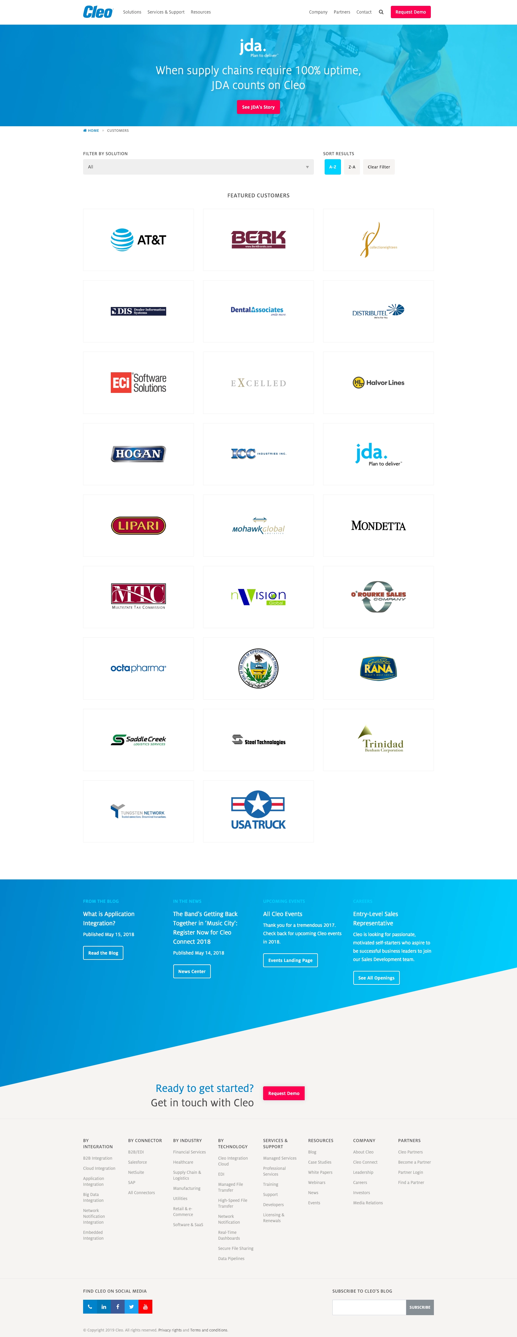
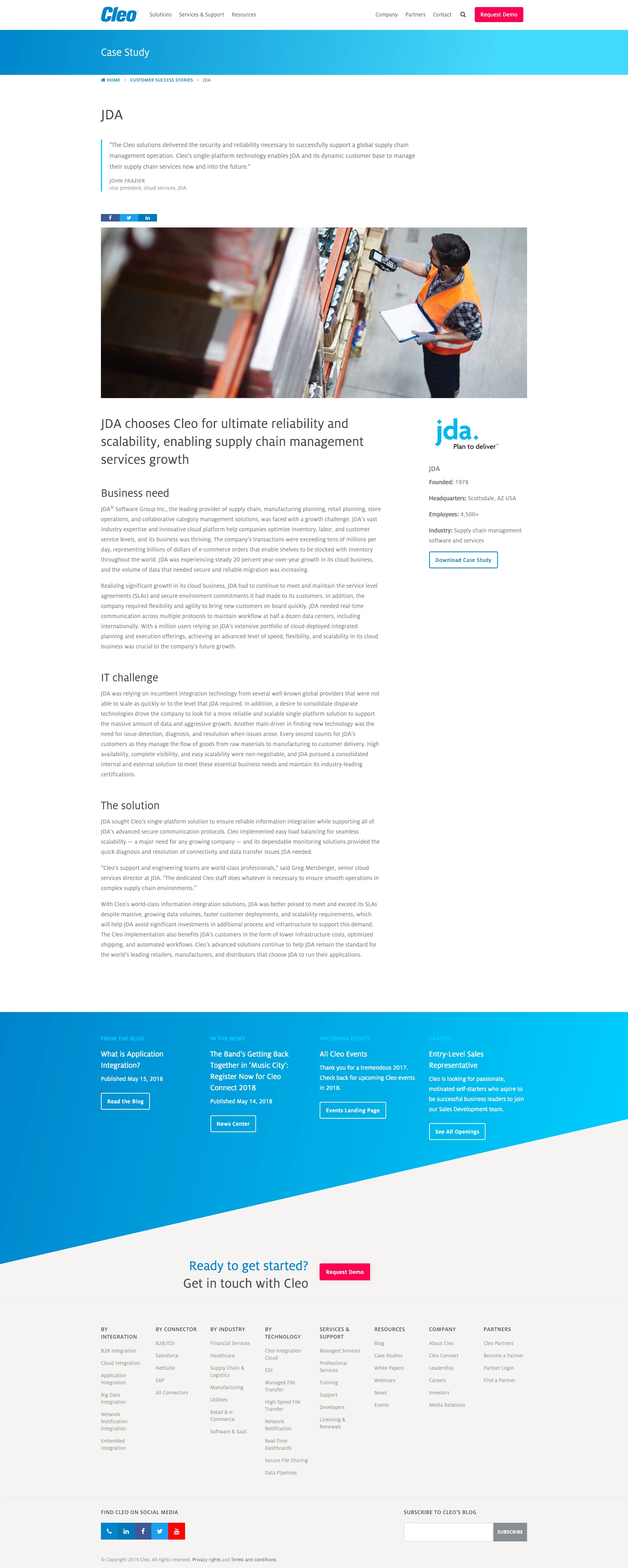
I wanted Cleo's website to feel bright, friendly, modern, and intuitive. When building a website, I usually start with a minimal and light color palette. In this case, Cleo's primary color (#0083ca) complemented the minimalist background colors, so I added a louder magenta color for strategic contrast. That color's job was to draw attention to key elements like buttons, calls to action, and navigation. Color plays a huge role in both user experience and tone.
I rely heavily on white space to shape my layouts. It gives each section room to breathe, keeps the interface from feeling crowded, and helps users absorb information with less effort. I'm not trying to bowl them over with information. Instead, I'm trying to give them the confidence that they're hiring a company who is confident in their product's capabilities.
In the software space especially, clean, uncluttered layouts increase usability by reducing visual noise and making key content easier to find. I also mix different forms of artwork: icons, logos, product screenshots, and occasionally stock photography all are employed to give different sections their own visual character.
Above all, every design decision supports a single purpose: leading users toward a meaningful interaction. Whether that's starting a chat, completing a form, or engaging with a product, the path should feel natural and intentional. A website is a company's best salesperson, and I treat it like a guided experience. Each visual choice working to move users forward with confidence and ease.
Supporting elements
Once I got through the core brand assets, larger and more complex assets like animation and motion graphics came into play. I produced several animated videos over my six years at Cleo, but the Cleo Jetsonic video below might be my favorite.
I also filmed and edited a recruitment video for our sales development team. The goal was to talk to real employees about what their experiences and growth opportunities were like at Cleo.
Conclusion
I think a customer's experience with a company should feel consistent no matter where it begins. Someone might start with a business card, move into an email thread, sit through a presentation, watch a product walkthrough, explore the website, and eventually reach a contract. Every one of those steps contributes to their impression of the brand.
On some level, I was involved at nearly every step.


My role is to make sure those touchpoints fit together — visually and tonally — so that nothing feels out of place. A customer should never question the professionalism or reliability of a company because the branding feels disjointed or uneven.


Ideally, the brand supports the entire journey. It should give people a sense of clarity and confidence, helping them feel understood and guided from the first hello through the final decision.
My work with Cleo represented my largest end-to-end branding project at the time. I developed the website, created the logo, and produced all supporting materials myself, which gave me the opportunity to build a cohesive brand from the ground up. There were no vendors involved. I learned to both edit videos and animate. It was a challenging and rewarding project that helped refine my process and broaden my capabilities.