MeshIQ Website and Brand Development
In the fall of 2022, I was contacted by Nastel Technologies about a rebranding opportunity. They were changing their name to MeshIQ and needed a new logo, website, and a collection of supporting assets to reflect the update. Rebrands like this don't come around often, so it was important to create a visual identity with long-term staying power.
The centerpiece of the rebrand was the logo and website, but the project also included lower-stakes print materials such as business cards, letterhead, and email signatures. On the digital side, I created assets like PowerPoint templates, animated SVGs, and branded case studies.
Jump to Page Screenshots"The work Billy did on our rebrand helped us modernize our presence and reach newer markets that weren't previously associated with our former brand identity.
It gave us a fresh start and positioned us more effectively for future growth."
— Navdeep Sidhu, CEO, MeshIQ


Project Kickoff
At its core, MeshIQ develops software that monitors business activity. Of course, there's more to it than that. Here's the company description as of this writing:
MeshIQ is a middleware observability and management platform that helps IT organizations and business executives gain insights into and manage their digital environments. It provides tools for monitoring, analyzing, and managing messaging middleware, event processing, and streaming platforms. MeshIQ enables proactive identification of performance bottlenecks and outages, and facilitates root cause analysis.
Software companies are notorious for writing paragraphs like this. I chose to focus on the core idea behind the pitch: observation.
When working on a rebranding project like this, I like to start with the logo — it sets the tone for the entire visual identity. The concept of observation brought owls to mind. The classic symbol of wisdom felt like a perfect metaphor for predictive IT software, and the visual of oversized eyes made the direction feel obvious.
Logo Development
Once you have a broad theme, you can begin selecting elements that reinforce it. For example, I initially chose a color palette of navy, midnight blue, and purples — fitting choices for a nocturnal creature like the owl.
I didn't have a clear initial concept for the owl icon itself. I sketched (and downloaded) more than 50 owl designs before hitting a wall and shifting my focus to typography.
From there, I experimented with all kinds of typefaces before landing on custom lettering built from circles and lines. With only six letters in the name, it wasn't too difficult to construct. Each character is based on two simple shapes, which felt both clever and efficient.
The real eureka moment came when I realized I could build the owl icon from the same shape used in the "Q" of the wordmark.

After a few rounds of feedback, the team settled on a green color palette used in the previous logo. They liked the nod to continuity for the existing customers, and I liked how it was a tastefully eccentric color choice that stood out from MeshIQ's competition.
A select of (properly) rejected wordmark sketches can be seen below. The idea was to show the brand in a series of bright colors to contrast the colorful, but muted, color palette from the previous logo. Standing out from the competition was very much the spirit of the brand.
Website Development
For the MeshIQ website rebuild, I approached the project with long-term maintainability in mind. As a contractor who wouldn't be around post-launch, I kept their WordPress installation as the platform so the full-time team could easily manage and update content without relying on a developer for day-to-day website updates.
I built the site primarily using Advanced Custom Fields (ACF) to create intuitive, custom-editable sections that empowered the team to make changes with confidence. Vertical sections could added to any page or post, with options to build out a section from scratch or work from a library of pre-built modules.
From a performance perspective, I prioritized a high score on Google PageSpeed Insights by removing jQuery in favor of lightweight, vanilla JavaScript.
Animations throughout the site — including several interactive SVGs — were handled with a combination of CSS and JavaScript to ensure both visual engagement and minimal overhead.
I also implemented a responsive image system that automatically generates multiple sizes from user uploads. When an image is selected for a page or blog post, the site builds a semantic <figure> and <picture> element structure, with built-in support for a <figcaption>, allowing for accessibility and flexibility without sacrificing speed or usability.
Speed and resource management are huge priorities — maybe the biggest priorities — in web development. A beautiful site isn't worth much if it's slow to load. I pay close attention to performance, optimizing images and code to ensure fast loading times across all devices. A fast site keeps users engaged and signals professionalism and trust.
Page Philosphy and Examples
My web design philosophy starts with simplicity, intentionality, and user guidance.
A selection of page images can be viewed by clicking any of the images in the carousel below. Press escape to return to this page after viewing.
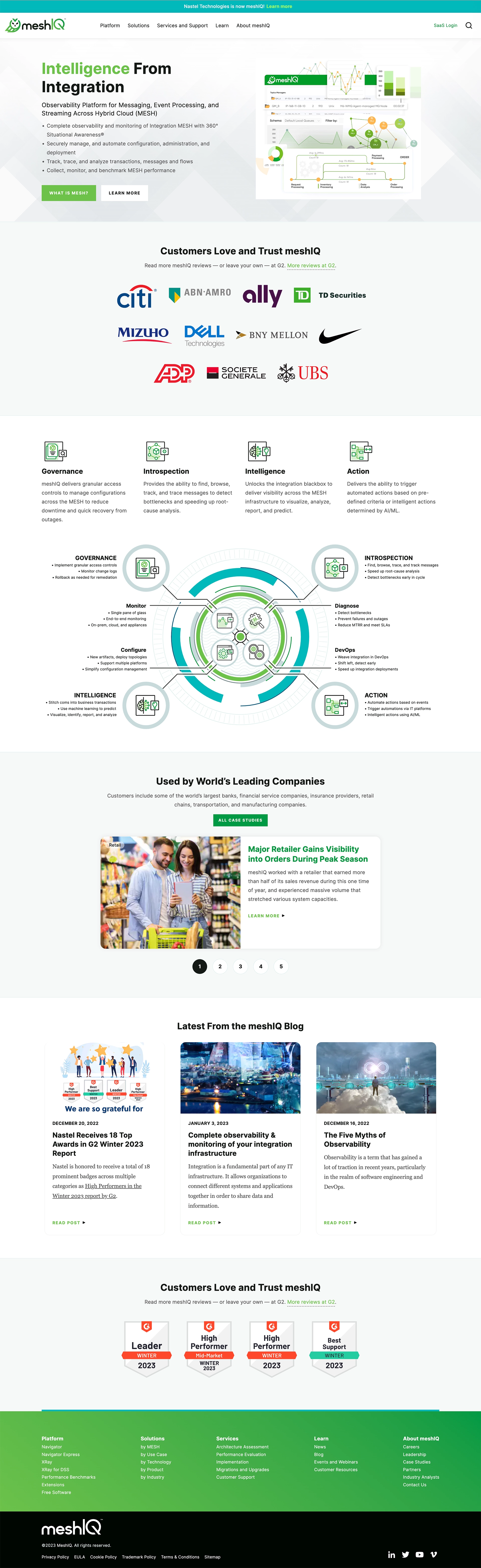
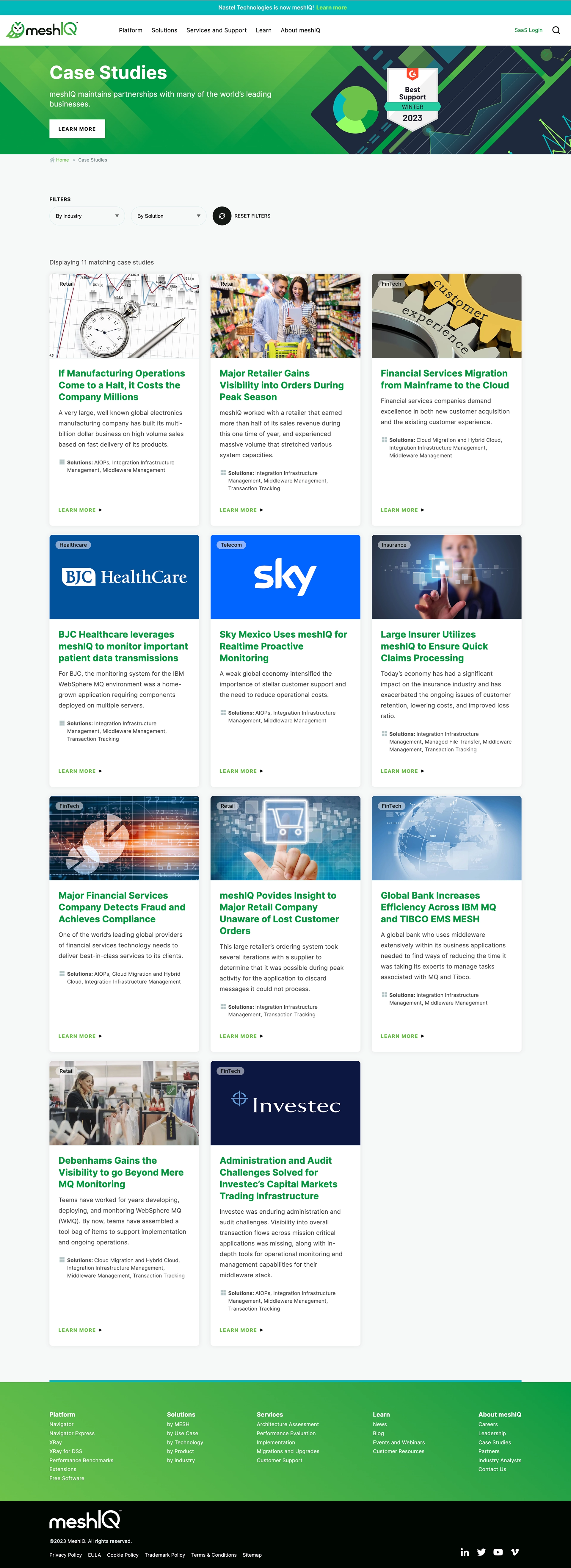
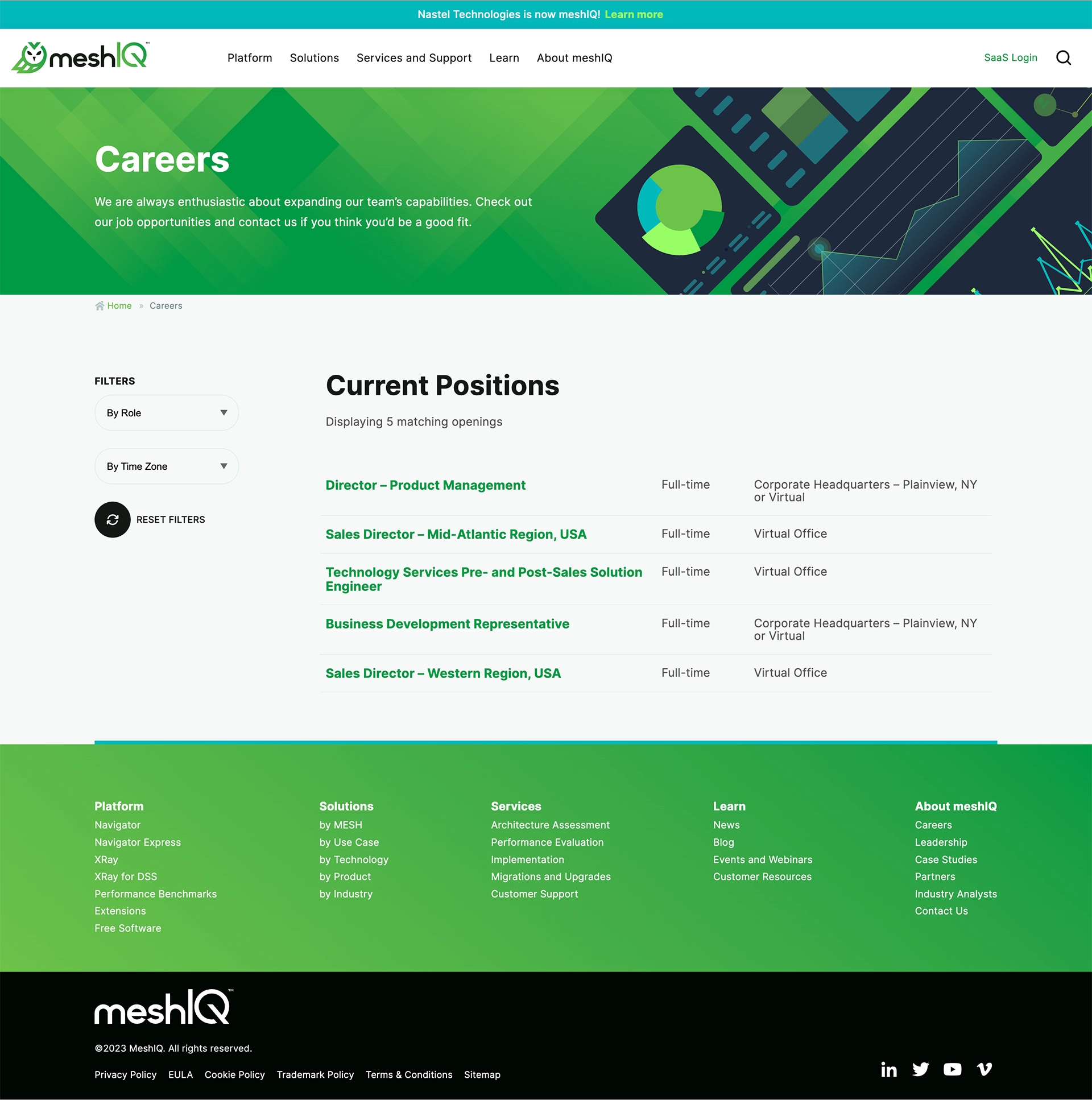
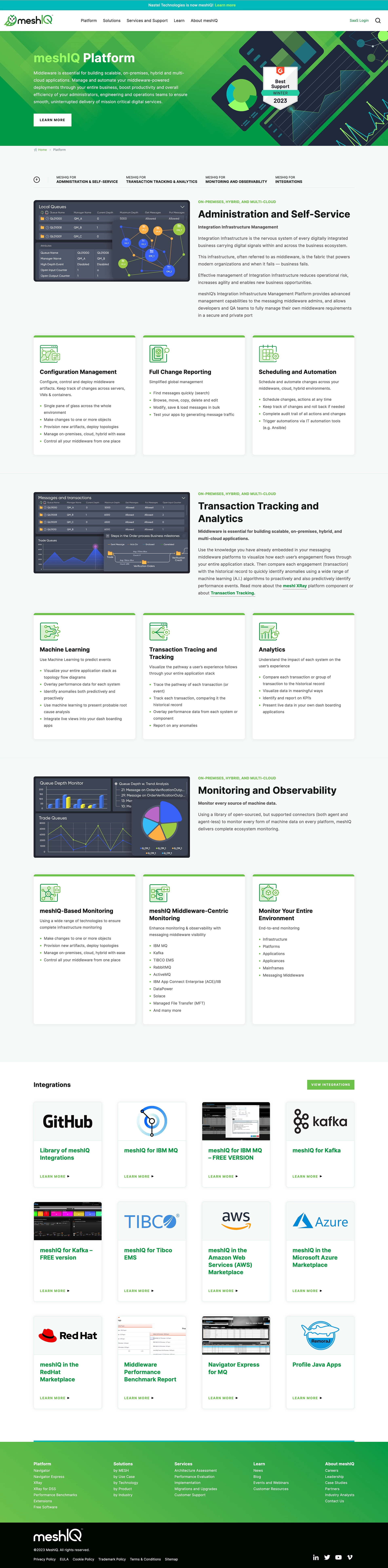
I believe that a website should feel intuitive from the first glance, and that starts with a clean, light color palette. I use bright, contrasting colors sparingly — but strategically — to draw attention to key elements like buttons, calls to action, and navigation. Color plays a huge role in directing users without overwhelming them.
White space plays a major role in my layouts. It gives content room to breathe and allows users to process information more comfortably. I avoid clutter, opting instead for designs that feel open and modern. This is especially important in the software space. A spacious layout not only looks elegant, but also improves usability by reducing visual noise and helping users focus on what's important.
Typography is, in my view, one of the most powerful tools a designer has. The right typeface, combined with thoughtful sizing and spacing, can convey brand personality, improve readability, and shape the entire user experience. I lean toward clean and modern type and use it to establish clear visual hierarchy — so that users instinctively know where to look first, and where to go next.
Ultimately, I design with a goal in mind: guiding the user toward a meaningful interaction. Whether it's starting a chat, filling out a contact form, or engaging with a product, the design should lead them there naturally. The website is a company's best salesperson. I see a website as a guided experience — each visual decision is a step that helps the user move forward with clarity and confidence.
Supporting elements


I believe it's essential for people to have a seamless, cohesive experience across every brand touchpoint. A potential customer might first meet a salesperson and receive a business card, which leads to an email, a follow-up sales presentation, and eventually a visit to your website. Along the way, they may watch a product or feature video, review sales collateral, sit through a demo, and — ideally — sign a contract.
Each of these moments should feel like part of a unified brand story. My job is to ensure that the customer never feels a visual, emotional, or experiential disconnect at any point along the journey. Marketing and design should never be the reason someone says, "Maybe this company or product isn't for me."
On the contrary, the brand should elevate the customer experience, making them feel confident, understood, and excited from the very first interaction to the final handshake.
Conclusion
I'm proud of the work I accomplished with the MeshIQ rebrand. The project balanced bold visual choices with practical needs across print and digital platforms. It was a rare opportunity to help shape a company's identity at such a pivotal moment. I'm excited to see how MeshIQ continues to grow into its new look and thrive in a rapidly evolving IT landscape.