Netreo Website Development and Brand Rebuild
In the spring of 2019, I was approached by Netreo, a B2B software company headquartered in Bakersfield, California, to lead a comprehensive website initiative. At the time, the company was looking to modernize its identity to better reflect its growth, capabilities, and evolving position in the enterprise IT space. It was determined that redesigning the website from the ground up was the best avenue to complete this objective.
Netreo needed a website that would resonate more clearly with their target audience and support their expanding product offerings. After the project kicked off, the scope was expanded to include a new logo and supporting brand materials.
In 2024, Netreo was acquired by BMC.
Jump to Page Screenshots
"I hired Billy Kulpa in early 2019 to rebrand Netreo, a company I started in my garage in 2000. Billy came highly recommended. The most important thing Billy did was listen. He gathered information before presenting a vision for transforming our public image. He created a new logo based on the fundamentals of our business, and expanded that story to public facing collateral like the website, booth graphics, white papers, and slide decks.
We also got a custom icon set, a new color palette, new typography, and all the bells and whistles that come with a rebrand.
The new branding elevated our company and supported our ability to connect with our both current and perspective clients. The rebrand also improved our internal self-image. Billy provided insight, ideas, and actionable plans that made sense. He was a genuine partner in improving my business."
— Kevin Kinsey, CEO, Netreo

Project Kickoff
Netreo is a California-based software company that monitors I.T. activity across the entire organization without needing to install software on every device. Here's the company description as of this writing:
Netreo is an IT infrastructure monitoring platform that helps organizations keep track of everything from servers and networks to cloud services and applications. It provides a complete, real-time view of your entire IT environment — without needing to install software agents on every device. Netreo monitors system performance, tracks network traffic, checks application availability, and alerts teams to issues before they become problems. It also logs configuration changes and offers customizable dashboards for easy visibility.
The engagement with Netreo began as a website redesign. But as the project team explored layout, usability, and content structure, it became clear that core brand elements — color, typography, tone, and more — would need to evolve in order to support the new direction. What began as a focused digital project quickly expanded into a full-scale rebrand.
The goal was to position Netreo as a modern, enterprise-ready solution while maintaining its reputation for simplicity and clarity. From there, the work extended to sales collateral, PowerPoint templates, iconography, and a refreshed logo.
My job was to create a unified, scalable brand system across all customer touchpoints.
Logo Development
The CEO liked the idea of incorporating "screens" — or perhaps "windows" — into the logo. The concept was that Netreo's core function is to provide organizations with windows into their IT environment. Users observe their systems through dashboards and take action when necessary. So, I began by sketching different configurations of squares.
I combined the idea of screens with the notion of upward trajectory to arrive at the final approved logo. Each square was 25% smaller than the one after it, implying more visibility the more the user digs in. The squares could stand alone as an icon and could appear in the brand colors, black, or white.
From there, I explored a wide range of typefaces before settling on custom lettering built from circles, ovals, and lines. I’ve said that before, but it’s my M.O. Each character is based on simple geometric shapes, which felt both clever and efficient.

Website Development
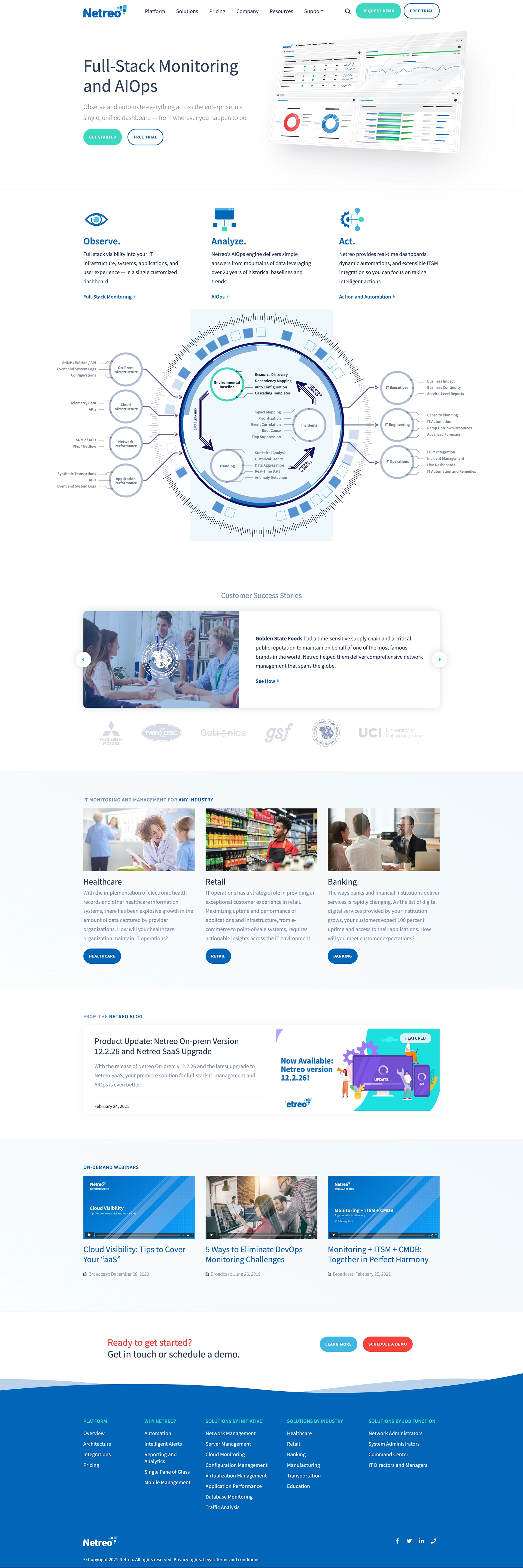
The Netreo website was a complete rebuild, from design and structure to content and code. While some of the original site's architecture for products and solutions carried over, nearly everything else started fresh, including the theme and copy.
This project became a blueprint for how I approach contract web development. Knowing I wouldn't be managing the site long-term, I focused on making it easy for Netreo's internal marketing team to take over. Since the team was already comfortable with WordPress, I developed a custom theme tailored to their workflows.
While the site's blog used WordPress' built-in WYSIWYG editor, the main site pages relied on the code editor — meaning editors had to drop raw markup directly into the page. That experience taught me a lasting lesson: content editors should never have to touch HTML just to make routine updates. It's become a core philosophy of mine: If editors need to dive into the codebase to do their jobs, then I haven't done mine properly.
This was also the project where I began prioritizing Google PageSpeed Insights scores. To boost performance, I removed WordPress's default jQuery dependency and rewrote the interactive features using lightweight vanilla JavaScript.
Animations, including interactive SVGs, were handled with a mix of CSS and vanilla JS — striking a balance between visual appeal and fast load times.
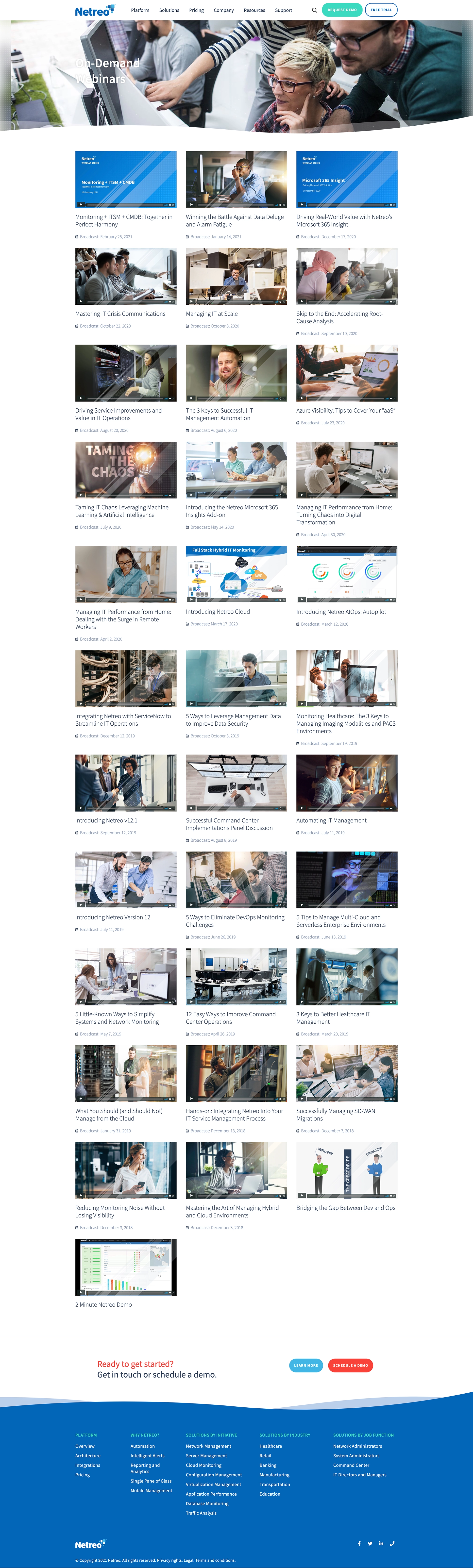
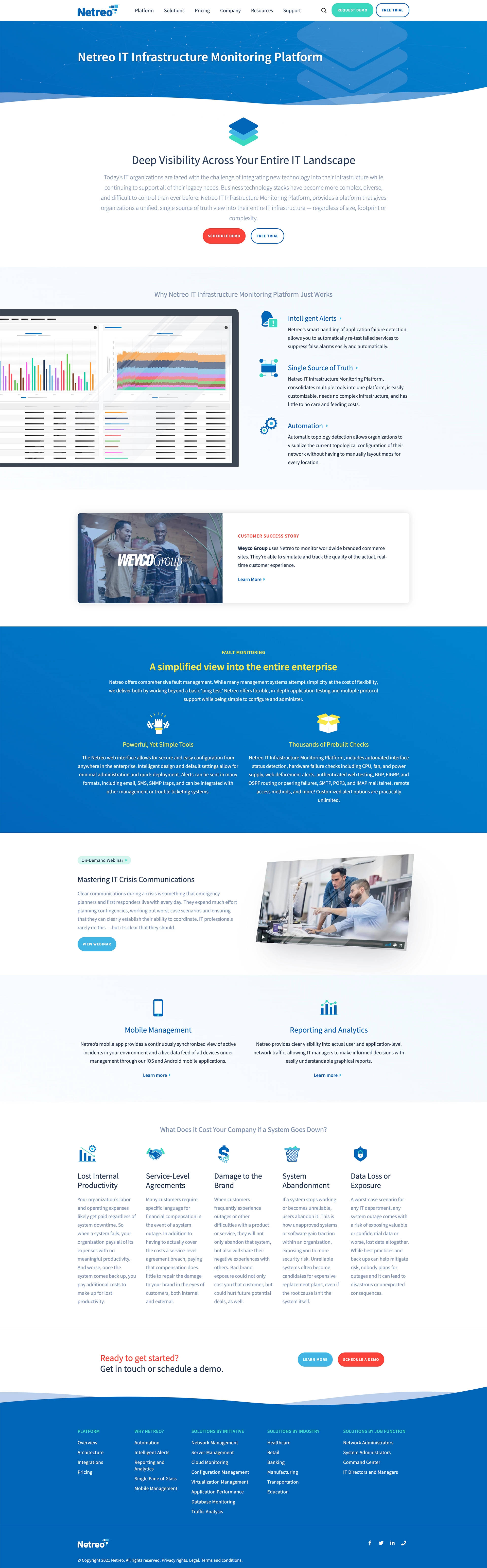
Page Philosphy and Examples
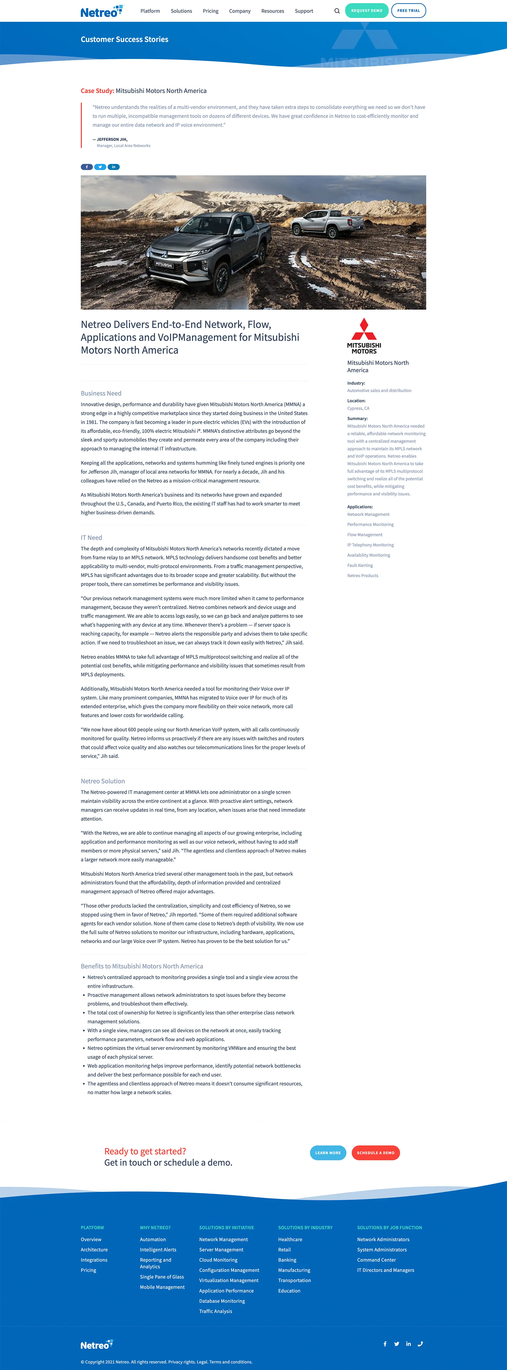
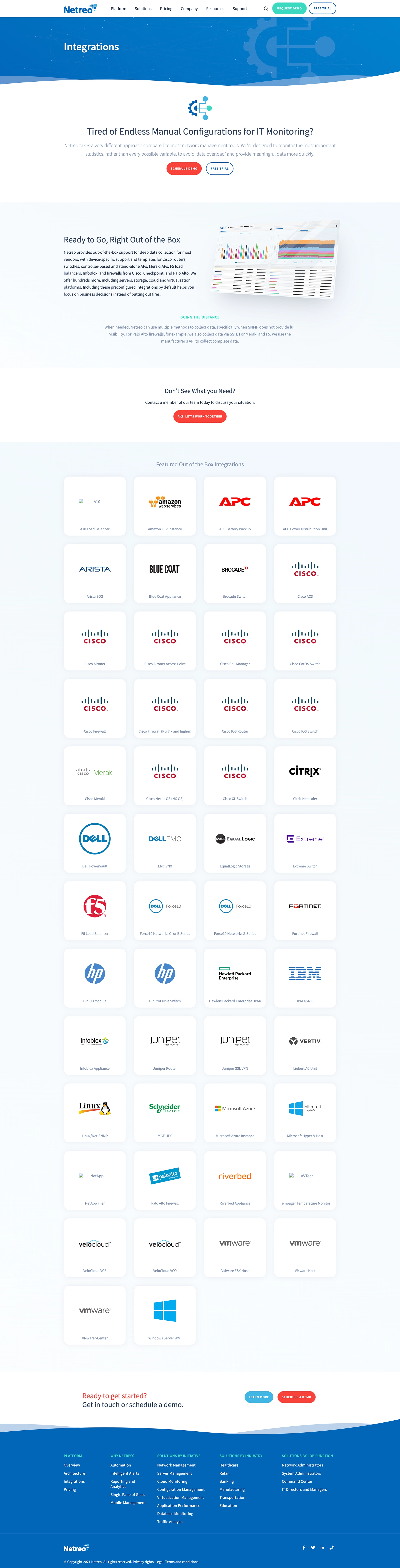
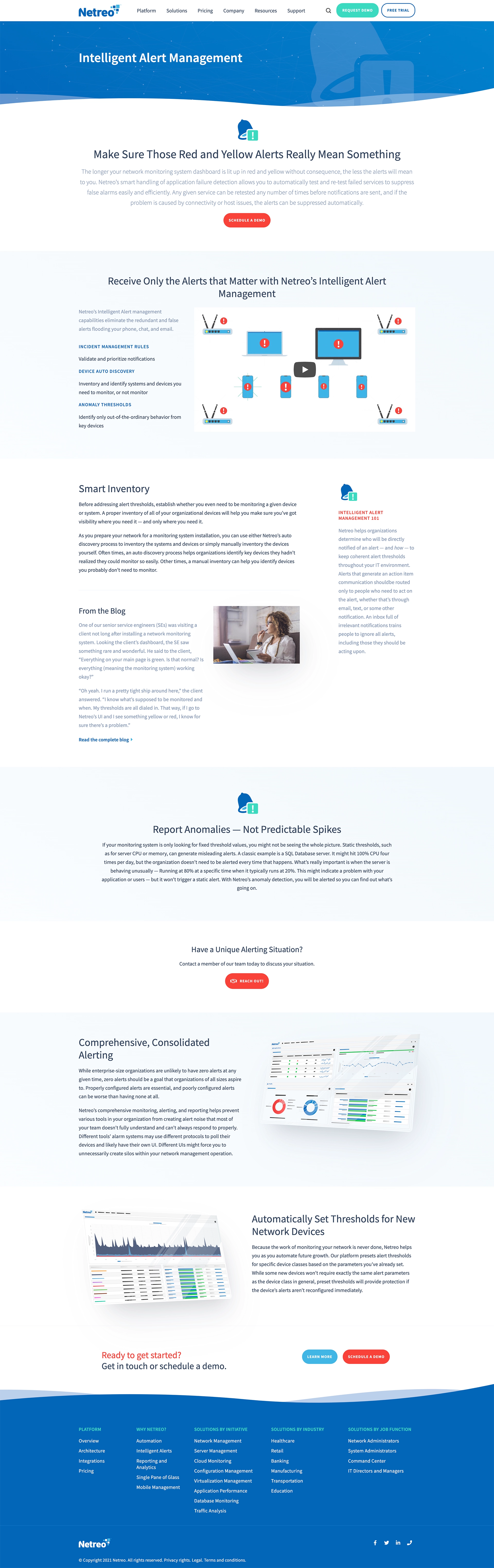
The visual design leans into a bright, West Coast-inspired palette, paired with a set of flexible brand patterns that translated seamlessly to print. The website should perfectly match everything from case studies to sales collateral.
I also created a series of stylized vector product screenshots. The goal was to highlight Netreo's clean UI while avoiding the versioning issues that come with literal screenshots. The result felt both recognizable and future-proof.
A selection of page images can be viewed by clicking any of the images in the carousel below. Press escape to return to this page after viewing.
Supporting Brand Elements
The core of my work for Netreo was the logo and website. But I also rolled out a suite of collateral, from case studies to business cards to letterhead. My job was to guarantee a consistent look and feel across every touchpoint.
The above animated video was created to support Netreo's business development efforts by clearly illustrating the value of their Intelligent Alerts feature. Designed for use in outbound email campaigns by BDRs, the video serves as a quick, engaging way to communicate how the feature helps IT teams stay ahead of issues through proactive, automated notifications. The goal was to simplify a complex capability into a compelling visual narrative that would capture attention and open the door to further conversations with potential customers.


I used a motif of dots and lines — representing the interconnected data points of all of an organization's devices — through Netreo's website and collateral. I was able to add an animated SVG layer over the top of their branded blue color to help bring that to life.
Conclusion
Looking back, the Netreo rebrand was a standout project — one that combined striking visual design with real-world functionality across both print and digital channels. It became kind of a template I would follow for future consulting projects.
It was a high-visibility chance to help define a company's identity during a major period of transformation. The end result not only gave Netreo a sharper, more cohesive presence — it also supported their trajectory toward acquisition, which speaks volumes about the brand's impact.
I'm proud to have played a part in that growth, and was delighted to see that the company was acquired by BMC in 2024.